LAV PRATAP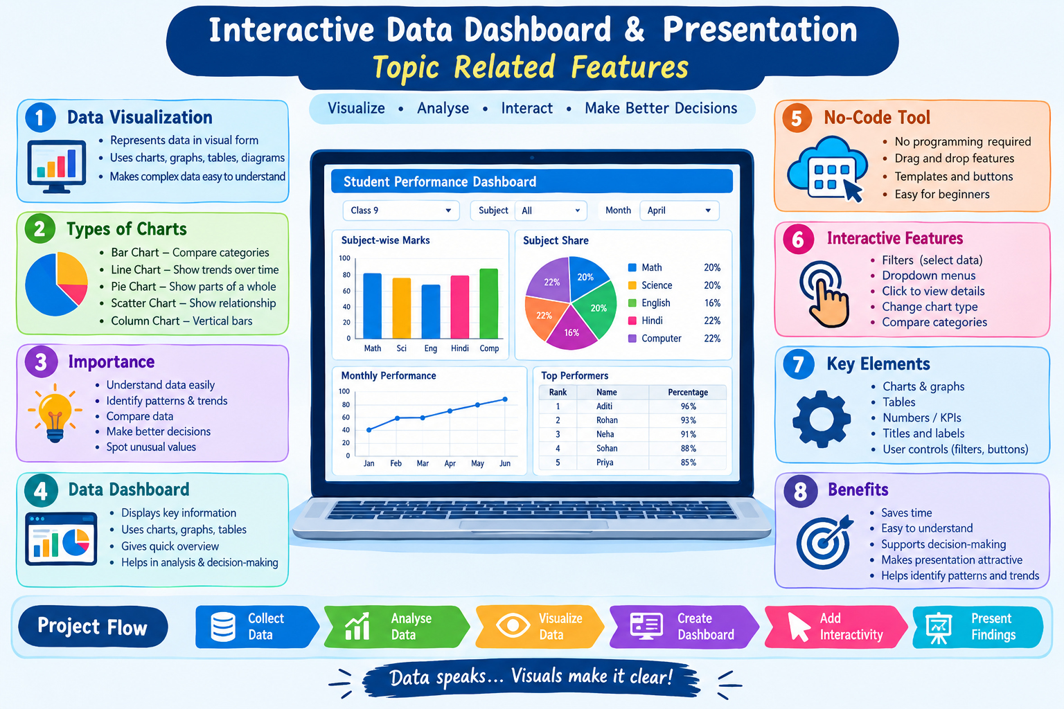
csaccept.com is a computer awareness website dedicated to providing reliable and easy-to-understand information about computer technology and digital safety. The website focuses on educating students, beginners, and general users about computer basics, cyber security, emerging technologies, and practical IT skills. Through informative articles, quizzes, and real-life examples, csaccept.com aims to increase digital literacy and help users stay safe and confident in today’s technology-driven world.
 Facebook ………………..
  Instagram ……………..
  Twitter ( X ) ……………..
  YouTube
Class 9 : Project Interactive Data Dashboard & Presentation
Artificial Intelligence / Data Literacy
1. What is Data Visualization?
Data Visualization means representing data in a visual form, such as charts, graphs, tables, diagrams and dashboards.
Instead of looking at a large amount of numbers, we can use a graph or chart to understand the information quickly.
Example:
Suppose the marks of five students are:
| Student | Marks |
|---|---|
| A | 65 |
| B | 80 |
| C | 55 |
| D | 90 |
| E | 75 |
It is easier to compare these marks using a bar chart.
2. Importance of Data Visualization
Data visualization is important because it helps us:
- Understand data easily – Complex data becomes simple and clear.
- Identify patterns – We can easily notice trends and patterns.
- Compare data – Different categories can be compared quickly.
- Find trends – Charts can show whether values are increasing or decreasing.
- Make decisions – Visual information helps in better decision-making.
- Identify unusual data – Very high or very low values can be noticed easily.
- Communicate information – Data can be presented effectively to others.
In simple words:
“Data visualization converts data into visual information that is easy to understand and analyse.”
3. What is a Data Dashboard?
A Data Dashboard is a visual screen that displays important information using charts, graphs, tables, numbers and other visual elements.
A dashboard allows users to understand important information at a glance.
Examples of dashboards:
- School attendance dashboard
- Student performance dashboard
- Sales dashboard
- Weather dashboard
- Sports statistics dashboard
Features of a Dashboard
A good dashboard should be:
- Simple
- Clear
- Interactive
- Easy to understand
- Visually attractive
- Relevant to the data
4. What is an Interactive Data Dashboard?
An Interactive Data Dashboard allows users to interact with the displayed data.
Users may be able to:
- Select a particular class
- Select a date
- Filter information
- Change the type of chart
- View detailed information
- Compare different categories
Example
A school dashboard could allow the user to select:
Class → Subject → Month
and then display the required student performance or attendance data.
5. What is Data Visualization with a No-Code Tool?
A No-Code Tool is a software tool that allows users to create applications, charts, dashboards or visualizations without writing programming code.
Instead of writing code, users generally use:
- Drag and drop
- Buttons
- Menus
- Templates
- Settings
- Data selection options
Advantages of No-Code Tools
- Easy for beginners
- No programming knowledge required
- Saves time
- Easy to modify
- Useful for creating dashboards quickly
- Helps students focus on data rather than coding
6. Creating a Simple Chart Using a No-Code Tool
A simple chart can be created using a no-code data visualization tool.
General Steps
Step 1: Collect the data.
Example:
| Subject | Marks |
|---|---|
| English | 75 |
| Hindi | 82 |
| Mathematics | 90 |
| Science | 85 |
| Computer | 95 |
Step 2: Open a no-code visualization tool.
Step 3: Import or enter the data.
Step 4: Select the required chart type.
For example:
- Bar Chart
- Line Chart
- Pie Chart
Step 5: Select the data fields.
Step 6: Customize the chart title and labels.
Step 7: Add filters or interactive features if required.
Step 8: Save or share the dashboard/chart.
7. Common Types of Charts
1. Bar Chart
Used to compare different categories.
Example: Marks in different subjects.
2. Line Chart
Used to show changes or trends over time.
Example: Monthly attendance.
3. Pie Chart
Used to show parts of a whole.
Example: Percentage of students choosing different subjects.
4. Column Chart
Similar to a bar chart but generally displays bars vertically.
5. Scatter Chart
Used to understand the relationship between two numerical values.
8. Choosing the Right Chart
| Purpose | Suitable Chart |
|---|---|
| Compare categories | Bar Chart |
| Show changes over time | Line Chart |
| Show percentage/share | Pie Chart |
| Show relationship between two values | Scatter Chart |
| Compare multiple categories | Bar/Column Chart |
9. Project: Interactive Data Dashboard & Presentation
The objective of this project is to collect data, visualize it and present it using an interactive dashboard.
Suggested Project Topic:
Class 9 Student Performance Dashboard
Data can include:
- Student names
- Mathematics marks
- Science marks
- English marks
- Computer marks
- Attendance
- Total marks
- Percentage
Dashboard can contain:
1. Bar Chart: Subject-wise marks
2. Pie Chart: Subject-wise contribution
3. Line Chart: Monthly performance
4. Table: Student information
5. Filter: Student/Class/Subject
10. Project Workflow
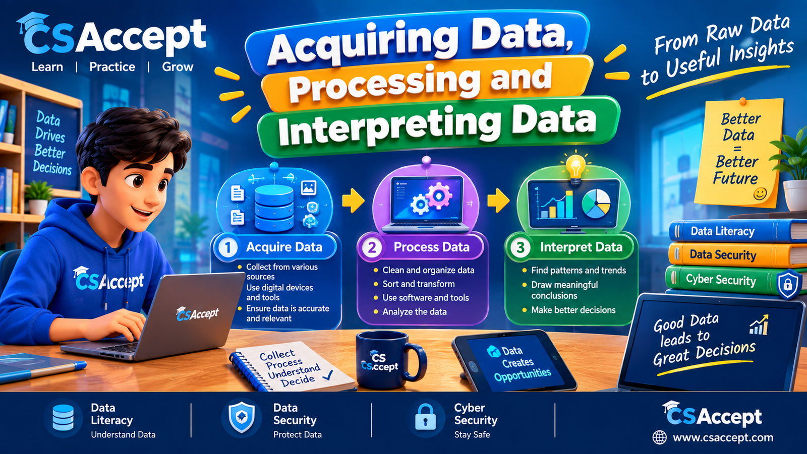
Collect Data → Organize Data → Analyse Data → Visualize Data → Create Dashboard → Add Interactivity → Present Findings
In simple form:
Data → Chart → Dashboard → Analysis → Presentation
11. What is Data Presentation?
Data Presentation means presenting collected and analysed data in a clear and meaningful way.
Data can be presented through:
- Tables
- Charts
- Graphs
- Dashboards
- Infographics
- Presentations
The purpose is to make the information easy to understand and communicate.
12. Advantages of an Interactive Dashboard
An interactive dashboard:
- Makes data easy to understand
- Saves time
- Provides quick information
- Allows filtering
- Helps compare data
- Makes presentations attractive
- Supports better decision-making
- Helps identify patterns and trends
Important Terms
| Term | Meaning |
|---|---|
| Data | Collection of facts and information |
| Visualization | Representing data visually |
| Chart | Visual representation of data |
| Dashboard | Screen containing important visual information |
| Interactive | Something that responds to user actions |
| No-Code Tool | Tool that can be used without programming |
| Filter | Used to display selected data |
| Trend | General direction in which data changes |
| Data Analysis | Process of examining and understanding data |
Short Answer Questions
Q1. What is data visualization?
Answer: Data visualization is the process of representing data using visual elements such as charts, graphs, tables and dashboards.
Q2. Why is data visualization important?
Answer: It makes complex data easy to understand, compare and analyse. It also helps identify patterns and trends.
Q3. What is a dashboard?
Answer: A dashboard is a visual interface that displays important information using charts, graphs, tables and other visual elements.
Q4. What is an interactive dashboard?
Answer: An interactive dashboard allows users to interact with data using features such as filters, selections and controls.
Q5. What is a No-Code Tool?
Answer: A No-Code Tool allows users to create applications, charts or dashboards without writing programming code.
Q6. Which chart is suitable for showing trends over time?
Answer: A Line Chart.
Q7. Which chart is useful for comparing categories?
Answer: A Bar Chart.
Q8. Which chart is generally used to show parts of a whole?
Answer: A Pie Chart.
Q9. What is a filter?
Answer: A filter is a feature used to display only the selected or required data.
Q10. Give two advantages of No-Code Tools.
Answer: They are easy to use and allow users to create visualizations quickly without programming.
⭐ Exam Revision
Remember this sequence:
Data → Analyse → Visualize → Dashboard → Interact → Present
Data Visualization: Data को charts/graphs के रूप में दिखाना।
Dashboard: Important information को एक जगह visually display करना।
No-Code: बिना programming code लिखे tool का उपयोग करना।
Bar Chart: Comparison
Line Chart: Trend
Pie Chart: Parts of a whole
Interactive Dashboard: User के interaction/filter के अनुसार data बदलना.
50 MCQs with Answers
1. What is data visualization?
A. Deleting data
B. Representing data visually
C. Hiding data
D. Collecting data
Answer: B. Representing data visually
2. Which of the following is an example of data visualization?
A. Paragraph
B. Chart
C. Password
D. File name
Answer: B. Chart
3. What is the main purpose of data visualization?
A. To make data difficult
B. To delete information
C. To make data easier to understand
D. To increase data size
Answer: C. To make data easier to understand
4. Which chart is best for comparing different categories?
A. Bar chart
B. Line chart
C. Pie chart
D. Scatter chart
Answer: A. Bar chart
5. Which chart is generally used to show trends over time?
A. Pie chart
B. Line chart
C. Bar chart
D. Table
Answer: B. Line chart
6. Which chart is commonly used to show parts of a whole?
A. Line chart
B. Bar chart
C. Pie chart
D. Scatter chart
Answer: C. Pie chart
7. A dashboard is used to:
A. Display important information visually
B. Delete files
C. Write computer programs
D. Store passwords
Answer: A. Display important information visually
8. What is an interactive dashboard?
A. A dashboard that cannot be changed
B. A dashboard that allows user interaction
C. A printed document
D. A text-only document
Answer: B. A dashboard that allows user interaction
9. Which feature can be used to display selected data in a dashboard?
A. Filter
B. Keyboard
C. Speaker
D. Printer
Answer: A. Filter
10. What does a filter do?
A. Deletes all data
B. Displays selected or required data
C. Changes the computer screen
D. Creates a password
Answer: B. Displays selected or required data
11. What is a No-Code Tool?
A. A tool that requires advanced programming
B. A tool that can be used without writing code
C. A tool used only for gaming
D. A hardware device
Answer: B. A tool that can be used without writing code
12. Which is an advantage of a No-Code Tool?
A. Requires complex programming
B. Difficult for beginners
C. Easy to use
D. Cannot create charts
Answer: C. Easy to use
13. No-Code tools are especially useful for:
A. Beginners
B. Only programmers
C. Only hardware engineers
D. Only network administrators
Answer: A. Beginners
14. Which of the following can be created using a data visualization tool?
A. Charts
B. Graphs
C. Dashboards
D. All of the above
Answer: D. All of the above
15. Which chart would be suitable for comparing marks in different subjects?
A. Bar chart
B. Line chart
C. Pie chart only
D. Scatter chart only
Answer: A. Bar chart
16. Which chart is suitable for showing monthly attendance?
A. Pie chart
B. Line chart
C. Bar chart only
D. Diagram
Answer: B. Line chart
17. Which chart can show the percentage share of different categories?
A. Pie chart
B. Line chart
C. Scatter chart
D. Flowchart
Answer: A. Pie chart
18. A scatter chart is mainly used to show:
A. A relationship between two numerical variables
B. Only percentages
C. Text paragraphs
D. File sizes
Answer: A. A relationship between two numerical variables
19. Which of the following is NOT a common chart type?
A. Bar chart
B. Line chart
C. Pie chart
D. Keyboard chart
Answer: D. Keyboard chart
20. What does a chart help us do?
A. Understand data visually
B. Hide information
C. Delete records
D. Format a computer
Answer: A. Understand data visually
21. Which of the following is an important benefit of visualization?
A. It makes comparison easier
B. It hides trends
C. It removes all data
D. It makes analysis impossible
Answer: A. It makes comparison easier
22. Data visualization can help identify:
A. Patterns
B. Trends
C. Unusual values
D. All of the above
Answer: D. All of the above
23. A trend refers to:
A. A general direction in which data changes
B. A computer virus
C. A type of keyboard
D. A file format
Answer: A. A general direction in which data changes
24. Which element can make a dashboard more interactive?
A. Filter
B. Selection control
C. Dropdown menu
D. All of the above
Answer: D. All of the above
25. Which of the following is an example of a dashboard?
A. Student performance dashboard
B. Blank notebook
C. Keyboard
D. Computer mouse
Answer: A. Student performance dashboard
26. A school dashboard may display:
A. Attendance
B. Student marks
C. Performance
D. All of the above
Answer: D. All of the above
27. What should a good dashboard be?
A. Complicated
B. Clear and easy to understand
C. Full of unnecessary information
D. Difficult to use
Answer: B. Clear and easy to understand
28. Which is an important characteristic of good data visualization?
A. Clarity
B. Confusion
C. Unnecessary decoration
D. Hidden labels
Answer: A. Clarity
29. Which step should generally come first in creating a dashboard?
A. Collect or prepare data
B. Print the dashboard
C. Delete the data
D. Close the software
Answer: A. Collect or prepare data
30. Which sequence is correct for creating a data dashboard?
A. Data → Visualization → Dashboard → Analysis
B. Dashboard → Delete data → Visualization
C. Print → Delete → Collect
D. Chart → Delete → Data
Answer: A. Data → Visualization → Dashboard → Analysis
31. What is data presentation?
A. Presenting data in a clear and meaningful way
B. Deleting data
C. Hiding information
D. Encrypting a computer
Answer: A. Presenting data in a clear and meaningful way
32. Which of these can be used for data presentation?
A. Tables
B. Charts
C. Graphs
D. All of the above
Answer: D. All of the above
33. Why are charts useful?
A. They make comparison easier
B. They always increase data size
C. They remove data
D. They make data invisible
Answer: A. They make comparison easier
34. What is the purpose of a chart title?
A. To describe what the chart represents
B. To delete the chart
C. To hide the data
D. To change the computer name
Answer: A. To describe what the chart represents
35. What are labels in a chart used for?
A. To identify information in the chart
B. To delete values
C. To close the software
D. To protect the computer
Answer: A. To identify information in the chart
36. Which visualization would be best for showing the number of students in different classes?
A. Bar chart
B. Line chart
C. Pie chart only
D. Text editor
Answer: A. Bar chart
37. Which visualization is suitable for showing a student’s performance from January to June?
A. Line chart
B. Pie chart
C. Bar chart only
D. Table only
Answer: A. Line chart
38. If a school wants to show how students are divided among Science, Commerce and Humanities, which chart could be useful?
A. Pie chart
B. Line chart
C. Scatter chart
D. Flowchart
Answer: A. Pie chart
39. What is data analysis?
A. Examining data to understand useful information
B. Deleting data
C. Printing data only
D. Hiding information
Answer: A. Examining data to understand useful information
40. Data visualization helps in decision-making by:
A. Making important information easier to understand
B. Hiding important information
C. Removing patterns
D. Increasing confusion
Answer: A. Making important information easier to understand
41. Which of the following is NOT an advantage of an interactive dashboard?
A. Quick access to information
B. Data filtering
C. Easy comparison
D. Making data more confusing
Answer: D. Making data more confusing
42. What is the meaning of “interactive”?
A. Able to respond to user actions
B. Unable to change
C. Printed on paper
D. Stored offline only
Answer: A. Able to respond to user actions
43. Which tool feature allows a user to select a particular category of data?
A. Filter
B. Speaker
C. Printer
D. Scanner
Answer: A. Filter
44. A dashboard can combine:
A. Charts
B. Tables
C. Numbers
D. All of the above
Answer: D. All of the above
45. Which of the following makes a dashboard easier to understand?
A. Clear titles and labels
B. Unnecessary information
C. Too many unrelated charts
D. Missing values
Answer: A. Clear titles and labels
46. Which tool approach allows a user to create visualizations using menus and drag-and-drop features?
A. No-Code approach
B. Manual programming only
C. Machine assembly
D. Hardware coding
Answer: A. No-Code approach
47. What is the main advantage of using a No-Code visualization tool for students?
A. It allows them to focus on data and visualization without needing programming
B. It requires advanced coding
C. It cannot create charts
D. It only works with games
Answer: A. It allows them to focus on data and visualization without needing programming
48. Which of the following is a good practice while creating a dashboard?
A. Use relevant charts
B. Use clear labels
C. Keep information organized
D. All of the above
Answer: D. All of the above
49. Which of the following represents the complete project flow?
A. Collect Data → Analyse → Visualize → Create Dashboard → Present
B. Delete Data → Print → Analyse
C. Create Dashboard → Collect Data → Delete Data
D. Print → Delete → Present
Answer: A. Collect Data → Analyse → Visualize → Create Dashboard → Present
50. What is the ultimate purpose of an Interactive Data Dashboard?
A. To make data difficult to understand
B. To provide clear, visual and interactive information
C. To delete unnecessary data
D. To replace all computer applications
Answer: B. To provide clear, visual and interactive information